As digital products grow, visual consistency becomes harder to maintain. A button built by one team looks slightly different from a button built by another team six months later. The spacing between sections varies depending on who made the page. Typography rules exist in someone's head but not in writing. The product starts to look assembled rather than designed.
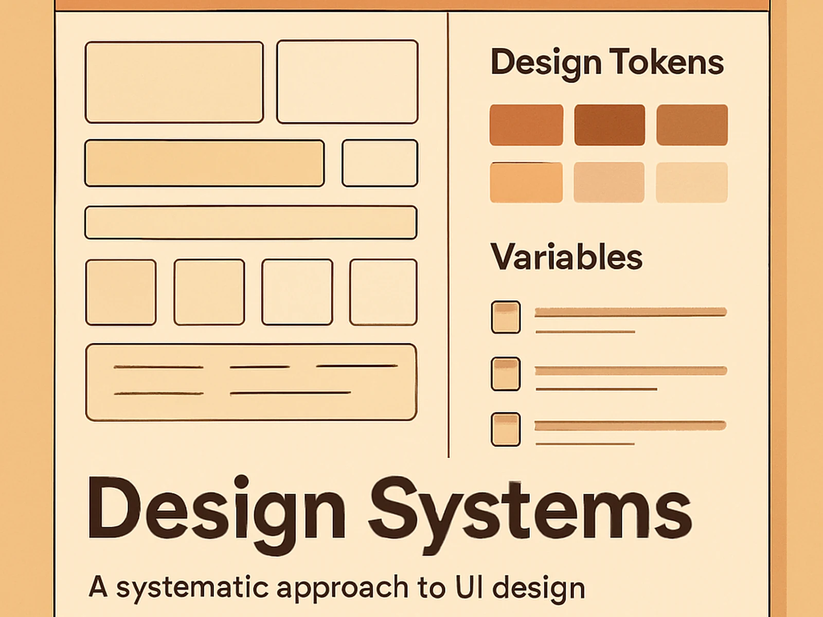
A design system resolves this by moving those decisions out of individual heads and into a shared set of documented rules. Colour tokens, typography scale, spacing units, elevation values, component specifications: when these exist in a form that both designers and developers can use, teams build faster and the product looks like a single coherent thing regardless of who built which feature.
We build design systems in Figma using variables, auto-layout, and component properties. Each component is built to a consistent standard, documented with usage notes and examples, and connected to the design tokens that drive it. A developer looking at a component in the system can understand exactly what is needed to implement it without interpretation.
For organisations with an existing product, we start with an inventory. We catalogue what exists, identify what is inconsistent, and produce a consolidation plan. Sometimes this means rebuilding from scratch. More often it means bringing order to what already exists and writing down the rules that were implicit.
What is included
Client feedback
"New features go faster now because the decisions are already made. The system paid for itself quickly."