A brand identity is not a logo. The logo is the most visible element of a larger system, but a logo without a system falls apart the moment it needs to appear on a second surface. Letterhead, social profile, invoice template, signage, website header: each context has different proportions, different background colours, different constraints. The identity needs rules that handle all of them consistently.
We start every brand identity project with positioning work. Before a single mark is drawn, we need to understand where the brand sits relative to its competitors, who it is talking to, and what it needs to say at a glance. This strategic layer is what separates an identity that works from one that merely looks decent on a presentation slide.
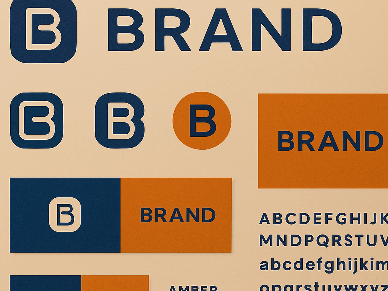
The deliverable is a complete brand system: primary and secondary marks, colour palette with all specifications, typographic scale and usage guidance, spacing and layout principles, photography direction, and a brand guidelines document that any designer, developer, or print supplier can use without needing to call you first.
For Swiss companies, we have experience designing identities that translate across all four national languages without losing coherence. If your market spans German, French, and Italian-speaking Switzerland, we build that requirement into the identity system from the beginning.
What is included
Client feedback
"For the first time our brand looks like a single thing across every surface. The guidelines document alone was worth the project."